Row
The Row element along with the Text Block are the two most frequently used visual composer [vc] elements.
The Row element gives structure to the page. The main function is to determine page layout. There are eleven preset page layouts to choose from: full width; 2 columns; 3 columns, 2/3 – 1/3, etc. Any selected vc element [text box, callout box, separator…] will generate a row with the element.
Note: if there is not an element placed in a row it will act as a “row space” on the page and will add an extra line space — best practice is to remove all unused row elements before publish.
Live site use examples:
- http://graduation.wharton.upenn.edu/ – six column template use for videos; three column template use for remaining content.
- http://standards.wharton.upenn.edu/photography/ – three column template use for image categories.
Visual composer ROW element with three columns with text block:
I am text block. Click edit button to change this text. Lorem ipsum dolor sit amet, consectetur adipiscing elit. Ut elit tellus, luctus nec ullamcorper mattis, pulvinar dapibus leo.
I am text block. Click edit button to change this text. Lorem ipsum dolor sit amet, consectetur adipiscing elit. Ut elit tellus, luctus nec ullamcorper mattis, pulvinar dapibus leo.
I am text block. Click edit button to change this text. Lorem ipsum dolor sit amet, consectetur adipiscing elit. Ut elit tellus, luctus nec ullamcorper mattis, pulvinar dapibus leo.
Text Block
The Text Block is the most frequently used visual composer element. It holds the majority of page content. Content can be styled using bold, italics, links, bullets and preset text styles/headers.
Note: fonts are set following the Wharton School standards. The text block has visible Lorum Ipsum content – highlight and delete.
Paragraph and Header Styles
Paragraph Text
I am text block. Click edit button to change this text.
Lorem ipsum dolor sit amet, consectetur adipiscing elit. Ut elit tellus, luctus nec ullamcorper mattis, pulvinar dapibus leo.
HEADING 1 Link Italics Bold
Heading 2 Link Italics Bold
Heading 3 Link Italics Bold
Heading 4 Link Italics Bold
Heading 5 Link Italics Bold
Heading 6 Link Italics Bold
Separator
Light gray line provides visual space and division between content or other on page elements.
Note: defaults to light gray and 1pixel — color and pixel size can be changed to highlight or emphasis content.
Live site use examples:
- using default light grey; 1 px; https://executivemba.wharton.upenn.edu/admissions/contact-us/
- using penn red color; 6px: https://lipmanfamilyprize.wharton.upenn.edu/meet-2016-honorees/
Visual composer SEPARATOR element in Penn blue:
Separator with Text
Light gray line with text added provides visual space and division between content or other on page elements. Text can be centered; left or right aligned. Text font is fixed – cannot be changed.
Note: defaults to light gray and 1 pixel — color and pixel size can be changed to highlight or emphasis content
Live site use examples:
- using default grey and 1 pixel; centered title “Student Perspective” text http://mba.wharton.upenn.edu/academics/
- using skyblue and 1 pixel; left aligned title “WELCOME” https://hr.wharton.upenn.edu/
Visual composer SEPARATOR WITH TEXT element
place text here
Toggled Accordian [FAQ]
Use this accordion list style for FAQs, instructions, bios, etc to prevent the page from becoming too long. Each toggle item is a separate page element so that it’s easy to move them around, change order, add or delete items.
Live site use examples:
- used as a supplement element to a committee member list – bio content placed in faq element to keep page from running long – “More” is used as title: http://lipmanfamilyprize.wharton.upenn.edu/us/steering-committee/
- standard FAQ use:
https://doctoral.wharton.upenn.edu/faq/
Visual composer TOGGLED ACCORDIAN element:
title text goes here
Content goes here
title text goes here
Content goes here
Tabs
Use to put information on a page without requiring a reader to leave the page or another option for page content organization. Tabs can be set for automatic rotation.
Note: 1st tab is “open” – content will be visible. Title tab text should have minimal characters for best fit – of course, this is dependent upon number of tabs used and how many tabs you can fit in a row — tabs will automatically create a second row of tabs once tabs reach the row margin .
See tab element “How To” video: https://marcomm.wharton.upenn.edu/how-to/visual-composer-tab-module/
Live site use examples:
- https://statistics.mbacareers.wharton.upenn.edu/full-time/industry-choices/
- incorporates a picture and content : http://doctoral.wharton.upenn.edu/programs-of-study/accounting/
Visual composer TAB element:
Can add any visual composer — in this case using standard text block element
Martech Button
Mainly used for “call to action” items such as apply now; visit us; register.
Note: text font is fixed; button color can be changed; can align left, center, right.
Live site use examples:
- http://standards.wharton.upenn.edu/students/ – wharton standards site – student logo call to action; Wharotn blue color used
- http://doctoral.wharton.upenn.edu/ – doctoral site — apply button; Wharton red color used.
Visual composer BUTTON element [with Wharton red background color]:
Message Box
Light blue message box with icon. Use this box for alerts, tips, instructions.
Note: defaults to light blue background and “I” information icon. Can be edited for different background color and icon but has not been tested on sites — most editors using defaults.
Live site use examples:
- http://standards.wharton.upenn.edu/know-the-brand/wharton-logo-and-name/
- http://doctoral.wharton.upenn.edu/application-requirements/
Visual composer MESSAGE BOX element:
Martech Callout Block
A flexible element used to “callout” or highlight specific page content; text box built in for adding and formatting content; defaults to light grey background color; allows for first and secondary heading text; martech button can be added to block.
Note: block background color can be changed; images/standard text styles can be added in the text block.
Live site use examples:
- http://undergrad.wharton.upenn.edu/career-exploration/ – used with content and different color background
- http://recruiters-corp.wharton.upenn.edu/recruiting/ – used on right hand side of page to highlight a publication.
Visual composer CALLOUT BLOCK element with button and image:
This is a callout box using the default grey background and inserting an image
This is a callout box using a blue background and reversing text out to white. altos using a button otpions.
Video Player
A simple video element that displays most video platforms on page using video link – i.e. youtube.
Note: video will size according to page row layout selected.
Live site use examples:
- https://graduation.wharton.upenn.edu/ugrad-mba-livestream-ceremonies/ — 2 and 3 column row layouts.
Video Player element example
Martech Hero Header
Wharton Undergraduate Program
How to add the Hero Header element
- open page for edit > select “martech hero header element” from visual composer element selections.
- open element > make size selection [short or tall]; add content in text box [this will be the content that appears over the background image]
Tip: This content is usually a Header 1 and/or Header 2 and “centered” - option to add a linked button is available.
- save changes > go to martech hero header element row:

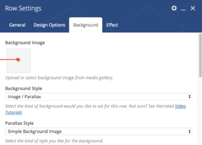
5. Select the “pencil” > you will see top tab options for General, Design, Background and Effect
6. Select “Background” > select Background dropdown > select “Image /Parallax” > select dropdown Parallax Style > select “Simple Background Image” > pull in your image where prompted from the media repository or your desktop >Select Background Override (Read Description) > select “Full” > save changes
7. Change page layout > used dropdown to change from “default” to “full window” [option is on right hand side of page] 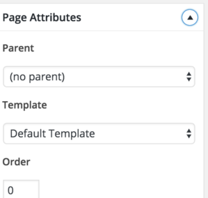
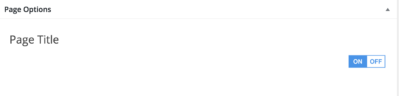
8. Turn page title to “off ” [option at bottom of page]